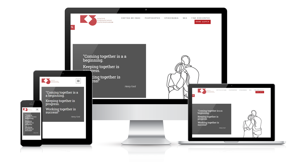
CANCER GUIDANCE CENTER Κ3 BRAND DEVELOPMENT
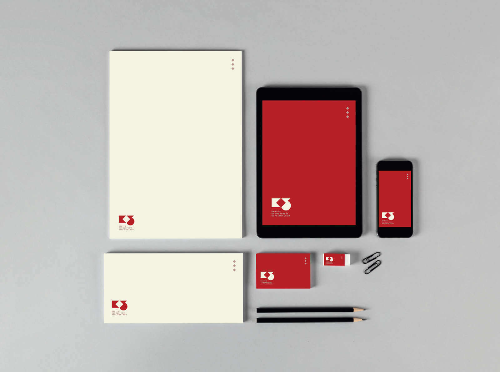
Creative Logo Design, Brand Identity Development and Communication & Promotion Materials
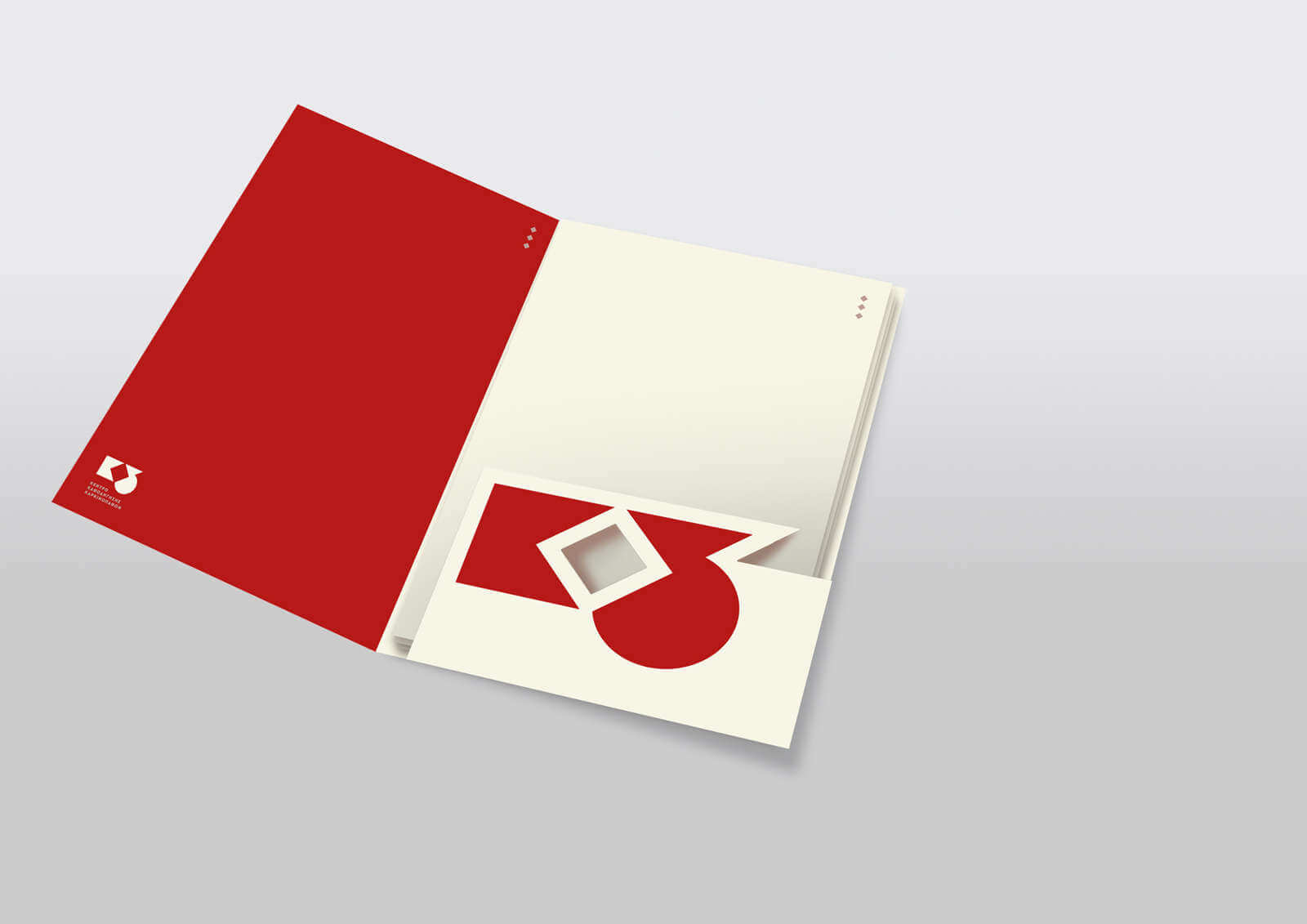
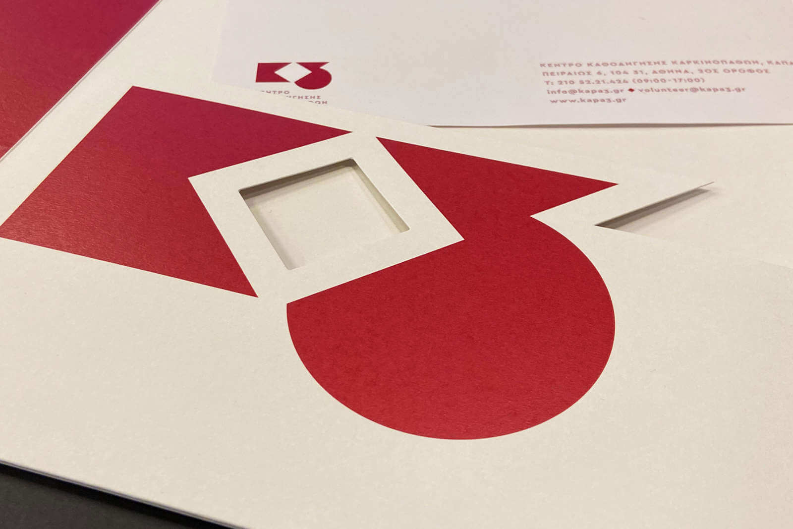
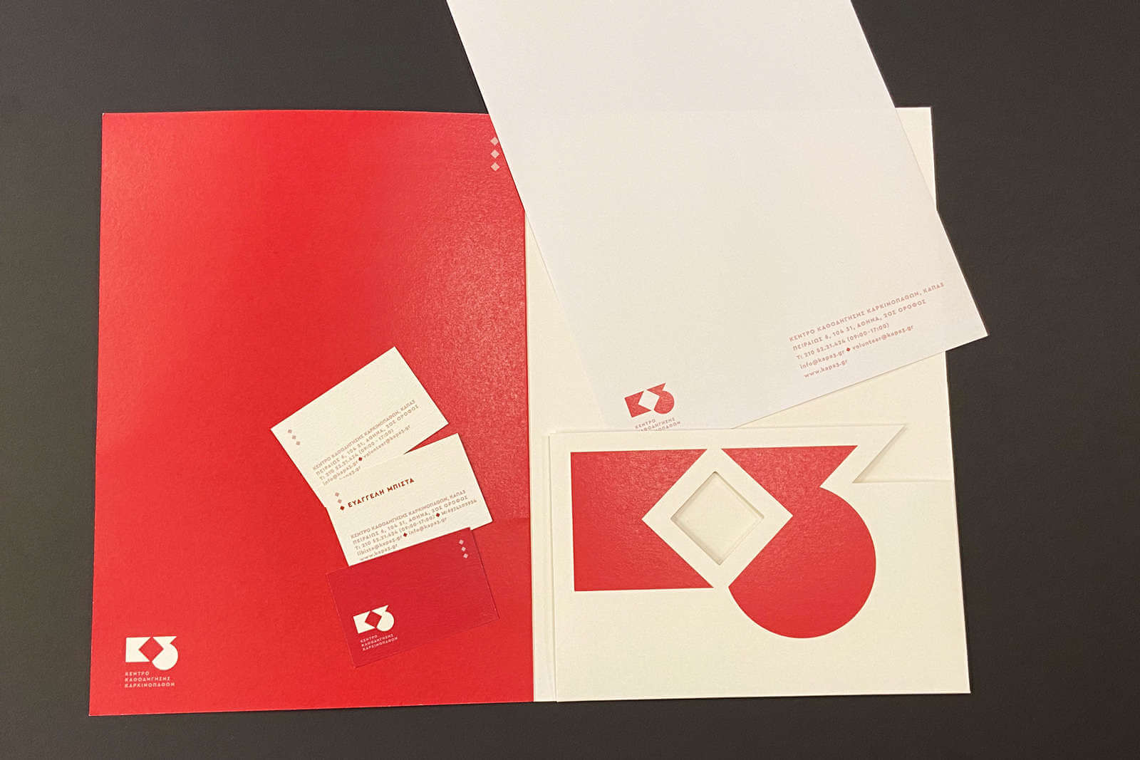
Central idea: 3 Κ
We looked for a short name, easy to remember and solid that can capture the concentrated force that hides inside the center. K3 was chosen as the description of the center consists of 3 words starting with K (Cancer Guidance Center). At the same time, we wanted to give logo a solid shape, a seal that will be the refuge of those who need it. The reason was that the audience we were addressing for such a sensitive issue, needed to feel that someone cares, that they can be supported somewhere.
The creative approach was based on the two symbols of the name, K and 3, which were designed in a way that gave them volume and substance, creating in their union a separate space for man, a refuge.